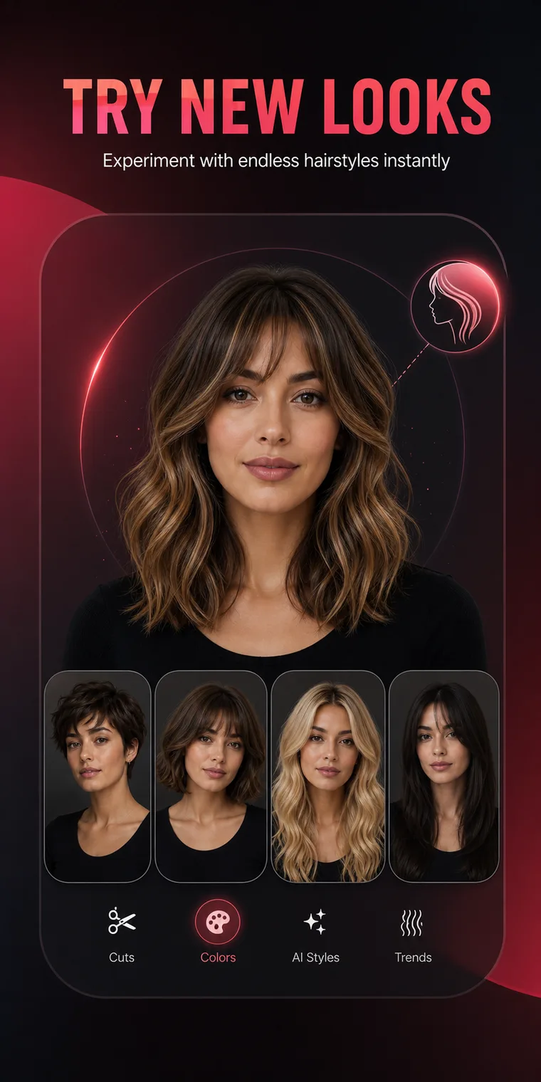
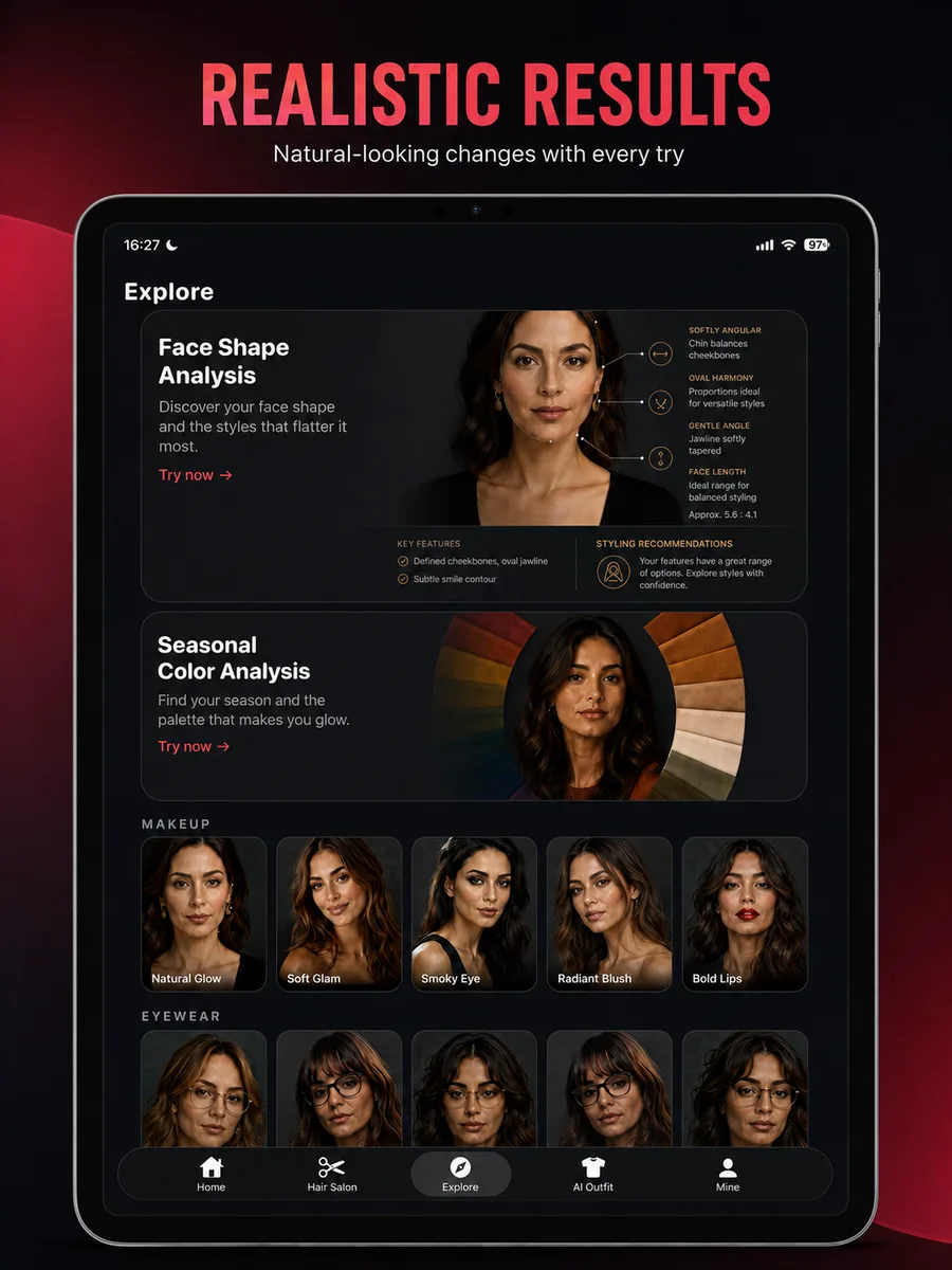
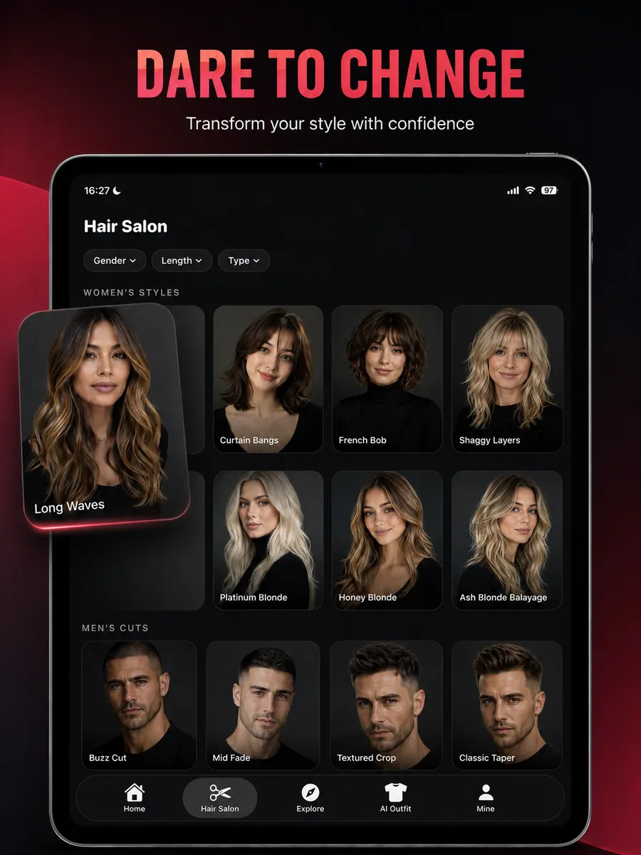
HairChanger guide
Virtual Hair Color Try-On Guide
How to compare hair colors on a photo and translate a digital shade into a safer salon conversation.
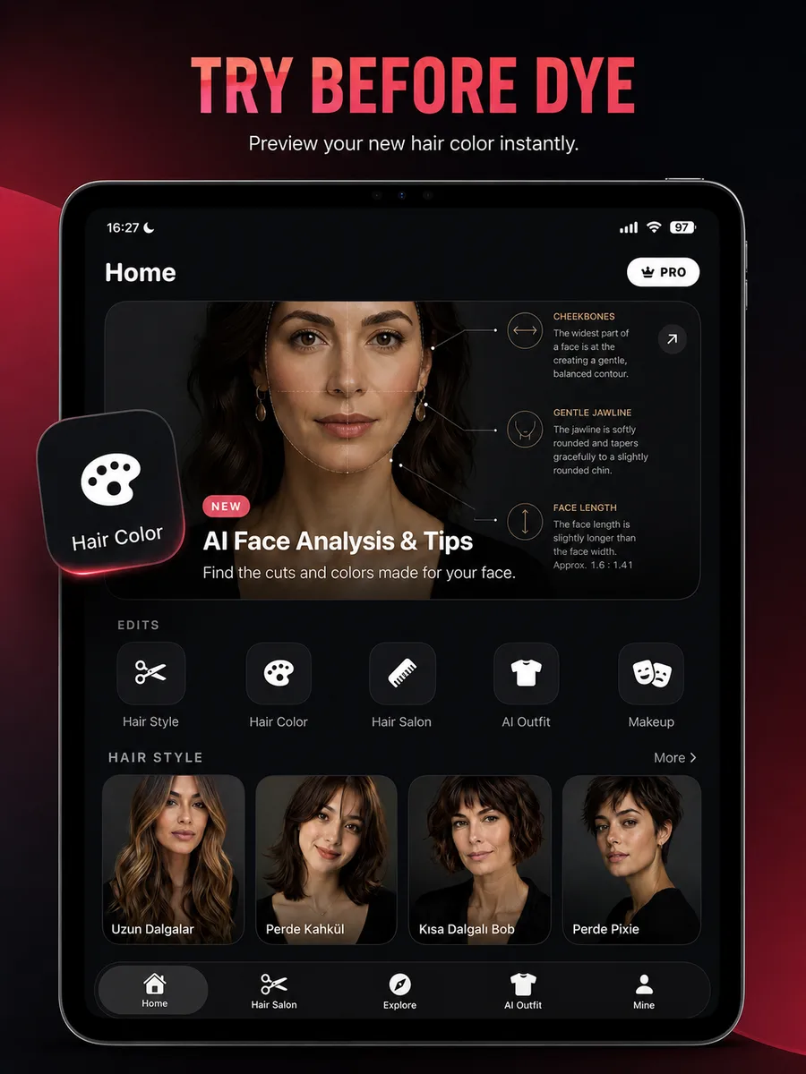
Compare color direction first
Start with broad families: warm versus cool, light versus deep, natural versus vivid. A honey blonde and ash blonde can have similar brightness but create very different contrast around the face. A copper and auburn share red warmth but differ in depth. Choosing the family first makes the salon formula discussion more productive.
Judge the color in more than one context
A color preview is affected by the lighting and clothing in the source photo. Test the same shade on a neutral photo and notice what happens to skin, eyes, brows, and the visible root. If a bright shirt is reflecting onto the face, do not use that single image to decide undertone.
- Warm or cool direction
- Overall depth
- Root contrast
- Face-framing brightness
- How brows and facial hair relate to the new color
Separate the goal from the process
The preview shows a destination, not the chemical steps required to reach it. A pale silver result may need extensive lightening, while a chocolate brunette may need only a gloss or deposit. Previous box dye, bleach, henna, and smoothing services can change the safe plan. A strand test helps a colorist evaluate lift and condition.
Bring a range, not one exact pixel
Digital screens, camera processing, and room lighting all shift color. Save two or three related previews and explain the common direction: warm caramel ribbons, deep cherry red, or cool beige blonde. This gives the colorist enough room to formulate for your base while preserving the intended look.